
Espresso House App Redesign
Some Context..
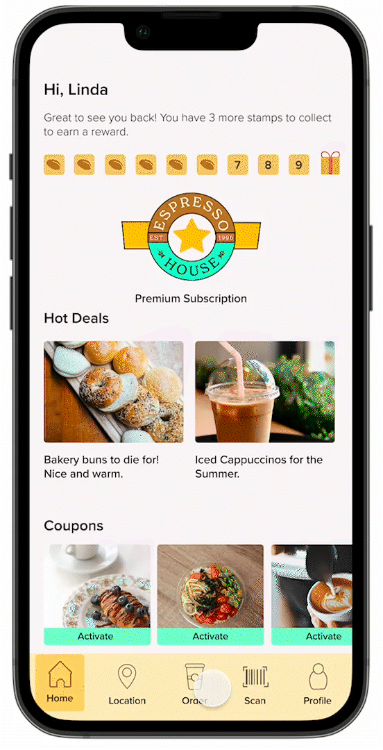
Espresso House is a cafe franchise located in Northern Europe. It originated from Sweden. They have a subscription-based business model. You can choose from different subscription options.
What we’re trying to do..
Espresso House have an app with which you can pre-order anything on the menu, and manage or purchase subscriptions. I’ve experienced multiple usability issues in the app after using it for years. Naturally, as UX/UI Designers, we solve problems. And that’s exactly what we’re about to do.
We’re going to focus on the user flow that involves ordering something from the menu. That’s the longest and most primary feature of the app. It also has the most friction.

Tools Used
So What’s Wrong Here?
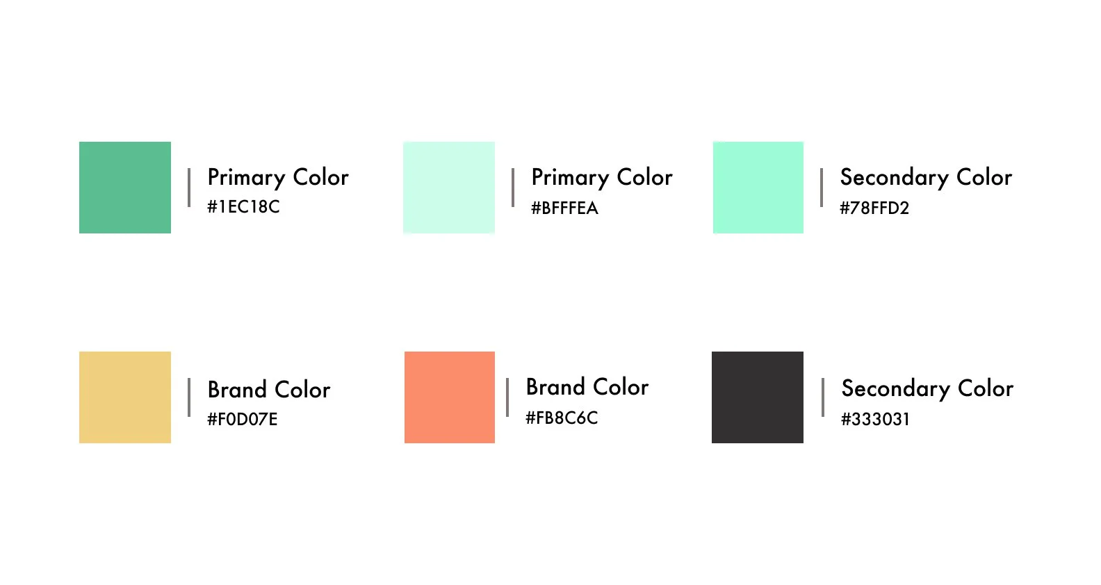
There was something missing with the color. I mean sure, we’re going for a look that is both colorful and professional. That being said, I feel as if we can brighten it up. When you go to a cafe, you’re usually there for a good time. So why not use colors that evoke those joyous emotions from the users.

Revamping the UI/UX
The new colors are vibrant and bolder. They also look professional and premium. Since Espresso House is meant for people from all ages and background, it’s important for the colors to be premium as well. Since people associate cafes with words like fancy and trendy. So with that in mind, these colors check all those aforementioned boxes.
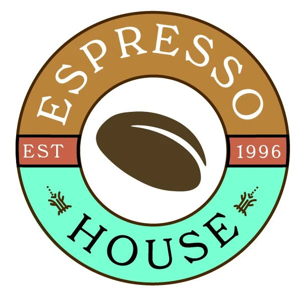
The new logo to the right looks a lot more vibrant. It has brighter colors and ditches the bottle cap look of the previous logo. So keeping all of that in mind, we can safely assume that this logo retains the original look of the previous logo. That being said, it tweaks things a bit and adds a modern twist to the previous logo and that was the plan all along.
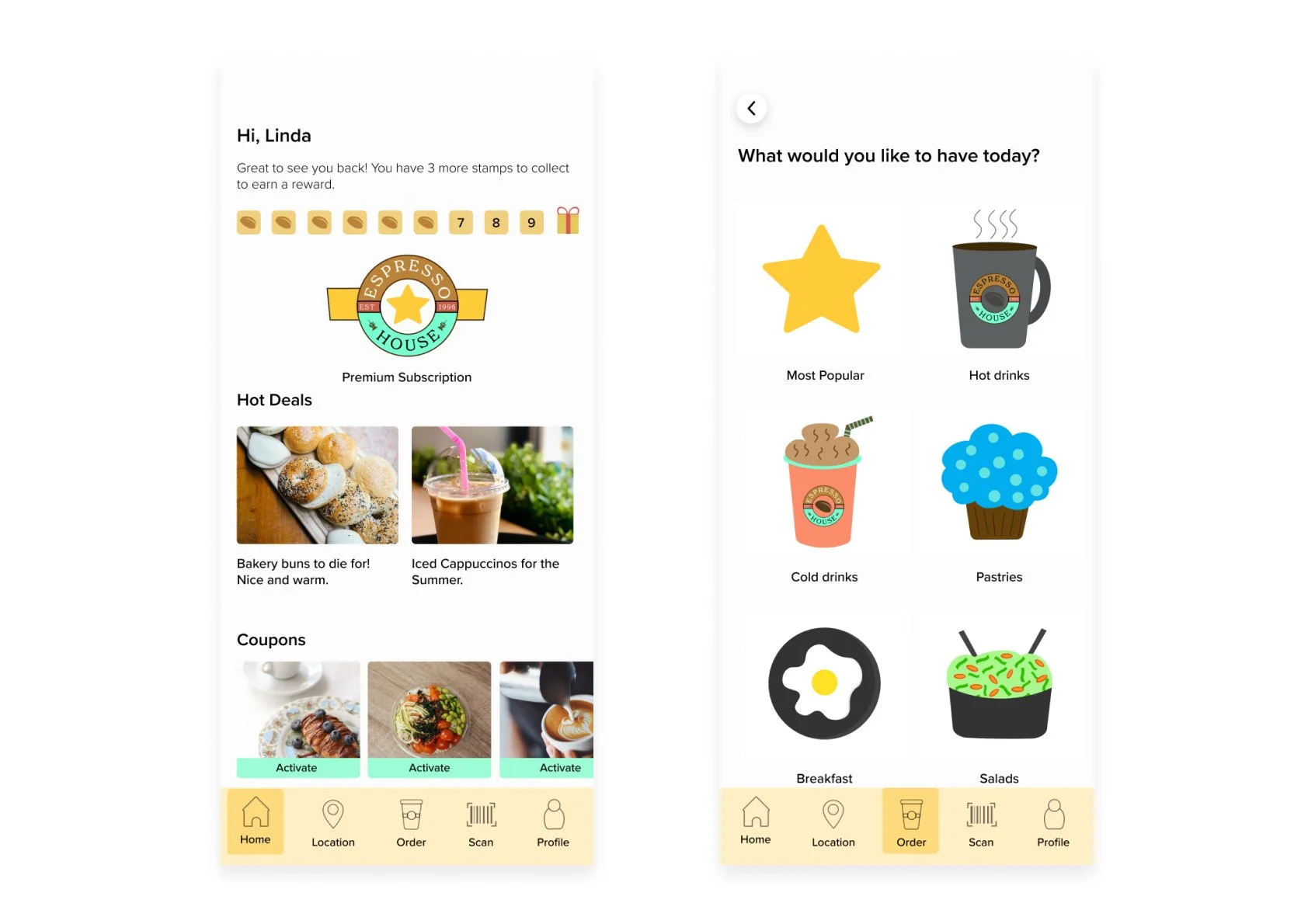
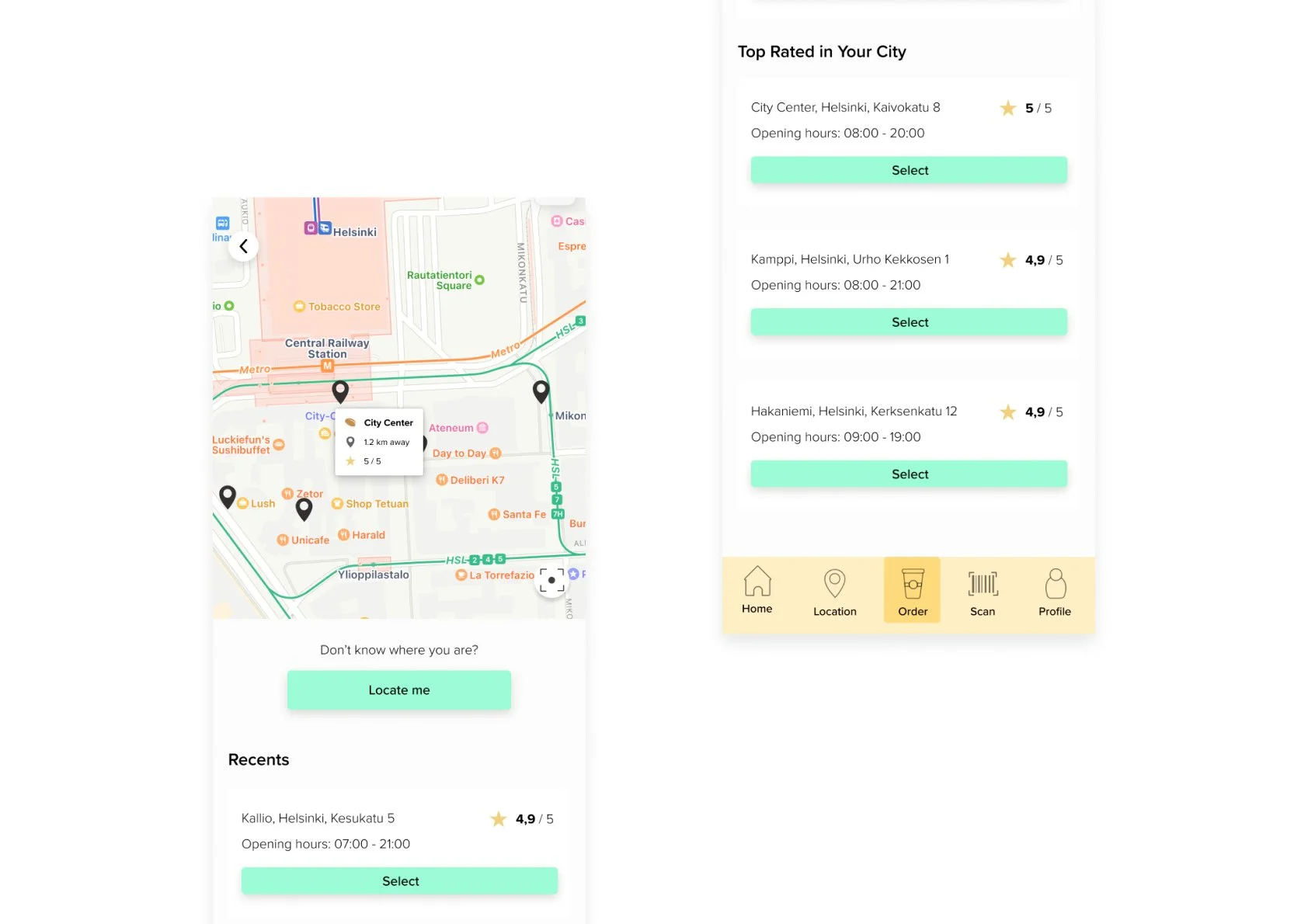
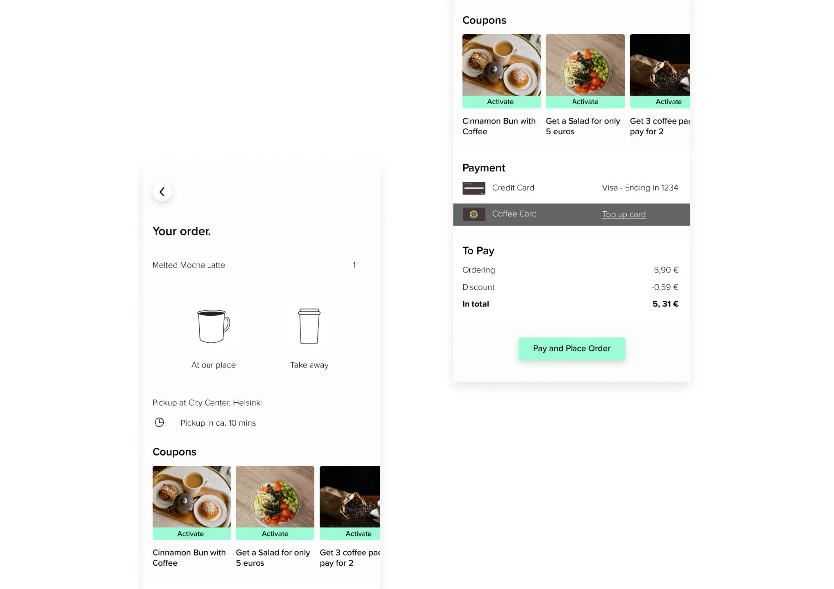
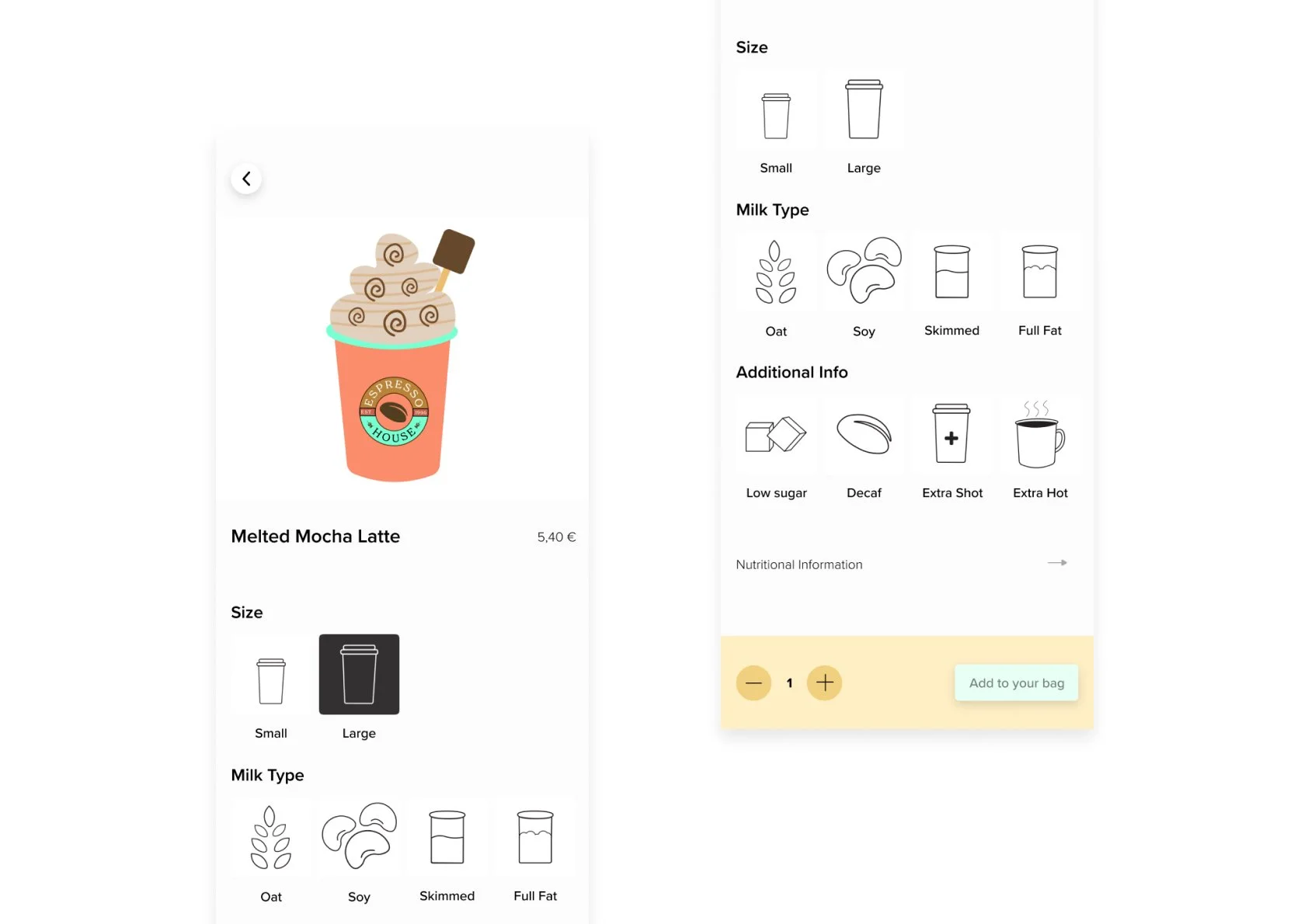
Ordering a Latte
Here’s an animated GIF of how a user can order a latte. It’s looking a lot different now. The design is more cohesive and follows a certain pattern. Whereas before, it lacked that element of uniformity to it.
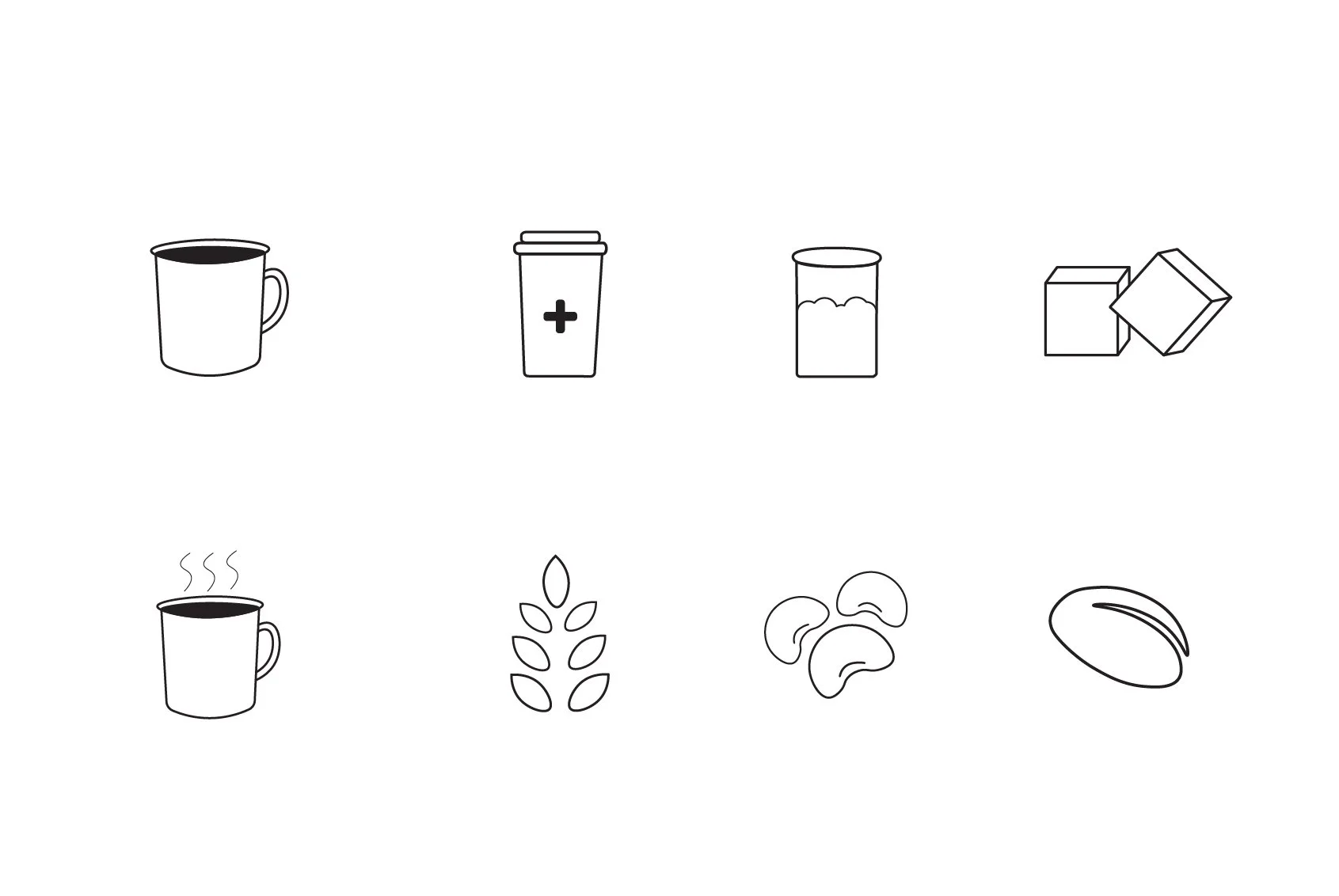
Illustrations and UI Elements
All of the illustrations and icons were done by me. It was an amazing time! I had the chance to work in Adole Illustrator and Photoshop. I really enjoyed letting my creative prowess shine through in combination with the UI/UX side of things. I am happy that I didn’t have to use any outside resources. Realying only on my creative skills allowed me to create content that was personalized to what I envisioned in the beginning.


Retrospect
What went well?
The execution of the project went really well. I got to combine graphic design with UI design which resulted in beautiful illustrations, icons, and wireframes. It was also great to work in a video editing tool like Adobe Premiere Pro to create an animated prototype gif to show what the prototype is capable of.
What didn’t go well?
Since this is an unsolicited redesign project, I didn’t have time to focus on user research. The reason for that is because I, myself, have been a user for years now. Therefore, it was sufficient that I conducted this project solo. So in the end, it worked out just fine.
What could be better?
It would be great to run a round of usability tests to find out some usability flaws in the prototype. Sure, I have been using the app for years. But it would be nice to know how other people feel about the prototype and if there are any usability issues there as well.