
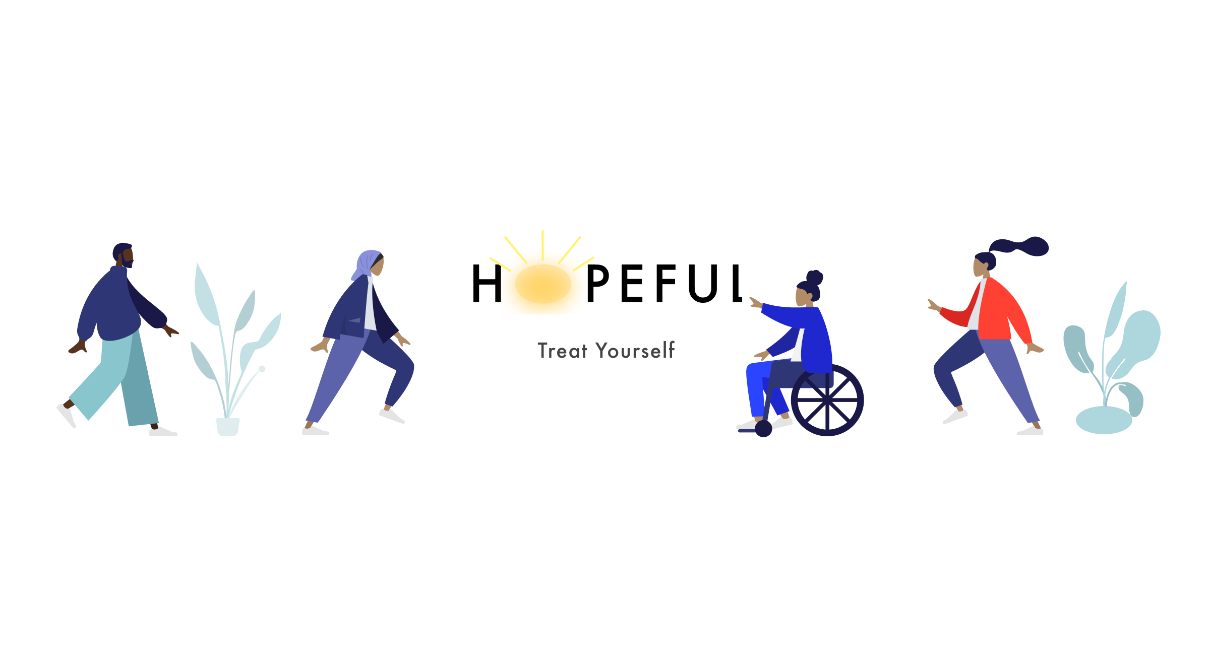
What is Hopeful?
Hopeful is a dynamic web application that lets users access online therapy, connecting them with licensed therapists whenever and wherever they need support.
Project role
UX/UI Designer
Duration
4 months

Tools Used
Workflow
Defining the Problem
Background
Few platforms effectively connect people dealing with mental health issues to professional support. Some focus more on meditation than therapy, while others that do offer therapeutic resources often don't provide much, if any, free content for users. Everything is behind a paywall. This is exactly what we want to change here. We want to provide mental health services at affordable prices, while providing free useful content.
Problem Statement
Folks seeking mental health support face barriers when accessing professional therapy services. Current platforms often emphasize meditation over traditional therapy, and those that do offer online therapy tend to lack accessible, free resources. This creates a gap for users who need a reliable, flexible, and affordable platform to connect with licensed therapists. How might we create a responsive web application that bridges this gap, allowing users to book therapy sessions easily, while also providing free content that supports their mental health journey?
Competitor Analysis
I focused on Headspace and Better Help as those are the industry leaders for mental health and therapy
Key Insights
Better help has a very confusing payment structure. Users have had issues with it
Users don’t want to commit to a monthly subscription plan
Headspace provides users with free content that engages them
Headspace uses gamification to retain users
Opportunity lies in creating a platform where the users can connect with real therapists to cope with anxiety at affordable prices
Understanding the User
Meet the Interviewees
Affinity Mapping
Findings
People are having difficulties with slow processing times using governmental institutions
Prices are very high for private institutes
Location seems to be a big issue as people don’t want to travel far
People have to go through an assessment phase to actually get to talk to a therapist here in Finland
Digital platforms are not primary means of reaching out for help (in Finland)
Websites have discoverability issues
Free consultation is available in order to get a feel for the therapists.
User Personas
It’s time to introduce the personas, meet Jodie and Carla. They are both at a different stage in their lives which translates into different motivations, goals, frustrations and needs. This is good! Because the more diverse the personas, the better it is.
User Journeys
User journeys are great for empathizing with the user for individual tasks. We have a scenario that builds up to a specific goal. You can then gauge how the user would feel while going through the entirety of the user flow. It gives you a chance to empathize effectively with the users.
User Stories and Flows
Following user journeys, I made user stories and flows. These were based on the most important aspects of the app, such as;
Booking an appointment with a therapist
Listening to a Sleepcast
Foundational Design
Booking a session
Here we can see how a user might book a session with a therapist using low fidelity wireframes for mobile.
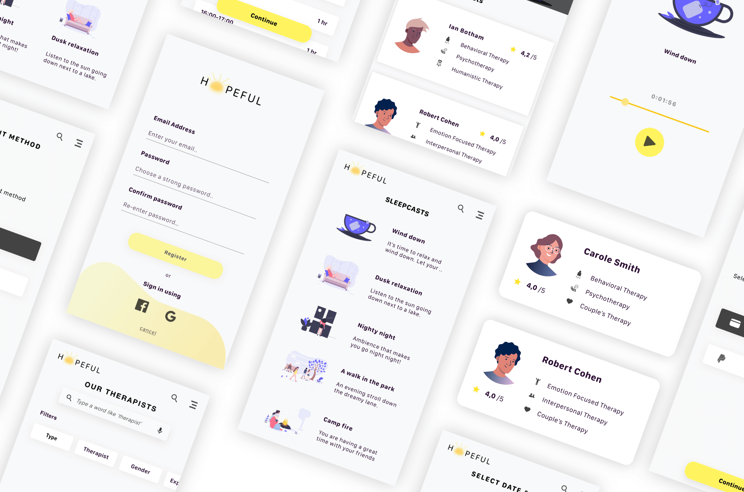
Listening to a Sleepcast
Users can also listen to Sleepcasts free of charge. It serves as a nice function of utility.
Final Design
Landing Page
Booking an Appointment
Listening to sleepcasts
How it works
This prototype shows how a user can book an appointment with a therapist. This is a direct need for one of our user, Carla. It’s also the most primary function of the app. So it’s very exciting to see it come to life. The flow is simple and user-friendly. It shows how a first time user can book an appointment with a therapist.
Usability Testing
A total of six participants gave valuable feedback that was analyzed further with a round of affinity mapping. The feedback was categorized according to observations, positive and negative feedback, and errors. Here’s a description below;
Key Insights
Users were satisfied with the functionality
The body text was too small, so it was enlarged
Appointments screen was modified as it lacked overview
Some missing screens were added
Changes after User Testing
Once the design was in the final stages I made some accessibility-related changes. The one below shows the error message that clearly shows which field is experiencing the error with the use of color and icons.

Here I added icons to the text so that it’s clear for everyone what the buttons mean.

Here I changed the colors to make the contrast better. The contrast between the dark grey and silver is more apparent.

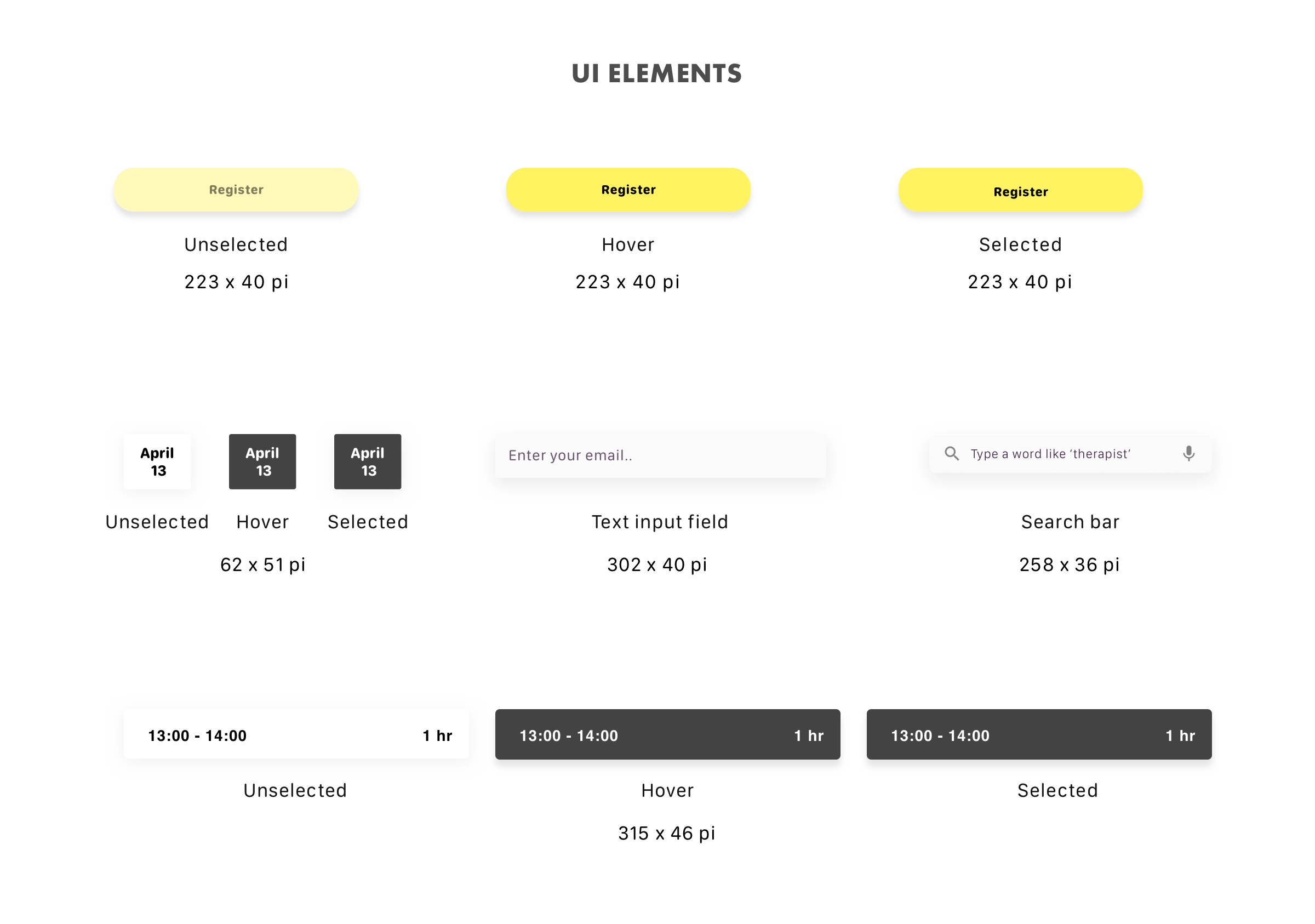
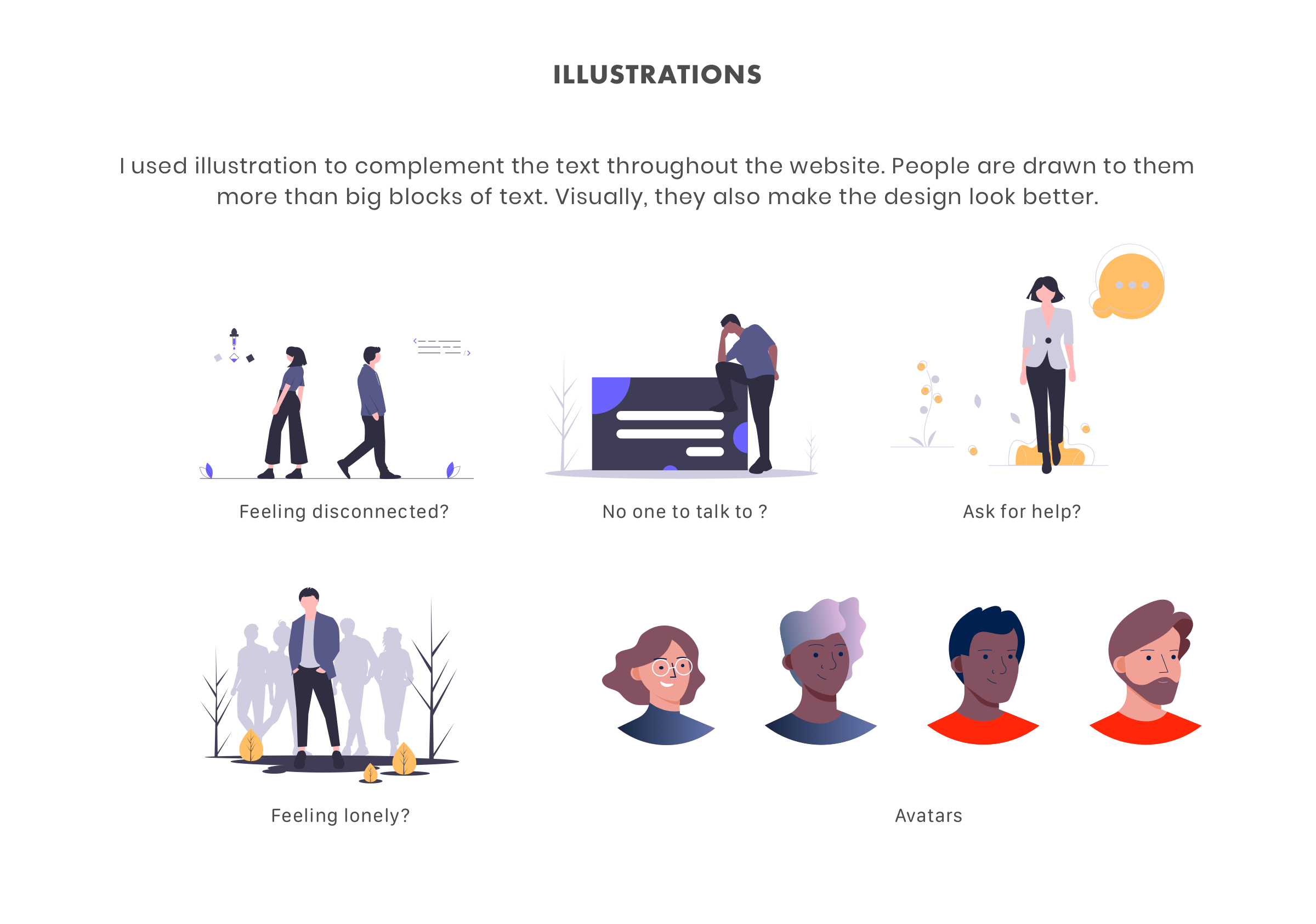
Design System

Retrospect
What went well?
I think the execution of this project went very well. I am satisfied with the design. I moved at a slow pace which allowed me to cover all the aspects of the design thinking process. From the initial phase, all the way down to the final product. My workflow touched on all the important aspects of what makes a great product. I’ve always put the users at the center of everything.
What didn't go well?
My mentor pointed out a few things that I could have done differently during the usability testing phase. He mentioned that some of my questions were generic and how I could improve them. I took the feedback very seriously as asking the right questions is a very important aspect of the user research process. Furthermore, while designing the wireframes, I made some errors which my mentor pointed out as well with the layout and spacing. This was a great turning point as it allowed me to think and reflect on my mistakes and eventually made me a better designer.
What could be better?
Some rounds of A/B testing would help out a lot. It would be nice to see how different versions of certain screens perform against each other. Perhaps, a second round of user testing after the changes were made could also be interesting. This way, we can find out whether the changes were relevant or not. Other than that, no issues at all. This project is extremely well-rounded.