
What is Leafy?
Leafy is a responsive web app that incorporates sustainability principles into its core values. The premise here is that shoppers can get products that are eco-friendly and have been made from sustainable sources. Purchasing items is hassle-free.
Objectives
To design an online store that works across all platforms, while keeping a mobile-first approach
Interviewing users about their goals, needs, and frustrations using similar products.
Identifying issues related to usability via user testing
The Process
Understanding the Problem
Mainstream consumerism isn’t about sustainability. It’s about buying more and more. Cheap stuff for low quality! So therefore, to counter that behavior, we’re building a platform that has products that are essential, high quality, and come from sustainable sources. This not only allows users to spend money on products they love, but also helps the planet as the products last a longer time thereby having less carbon footprint.
Problem Statement
Our users need to pruchase items from sustainable sources because mainstream consumerism doesn’t focus on sustainability issues all that much. We will know this to be true when we see users purchasing items from our store and have a total of 1000 registered users in the first 3 weeks.
Competitive Analysis
Here we analyzed how the competition reaches their target audience? How they position themselves in the market? What means they use to communicate with their target audiences? We also conducted SWOT analyses and focused on marketing strategies.


Findings
Neither of these platforms focus on sustainable products specifically
Amazon offers all kinds of products, however, it’s not tailored for sustainable products
Products from Amazon are cheap but can be of lower quality
Zalando has the more premium options
A product tailored for people looking for sustainable products can be lucrative
User Interviews
Findings
People would like to purchase items that come from sustainable sources
Amazon and other big players are boring for some people
People would like to reduce the carbon footprint of the products they purchase
Interviewees would be okay with paying a bit more for better quality products
Big amazon takes away from smaller businesses, so people would like to support smaller businesses as well
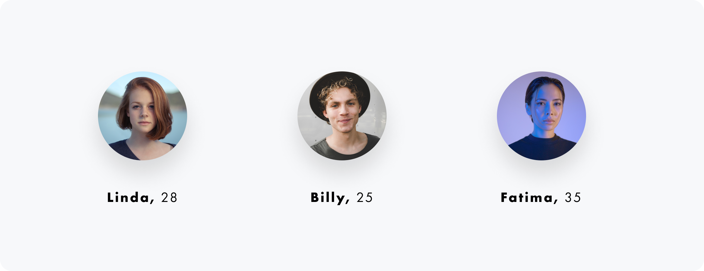
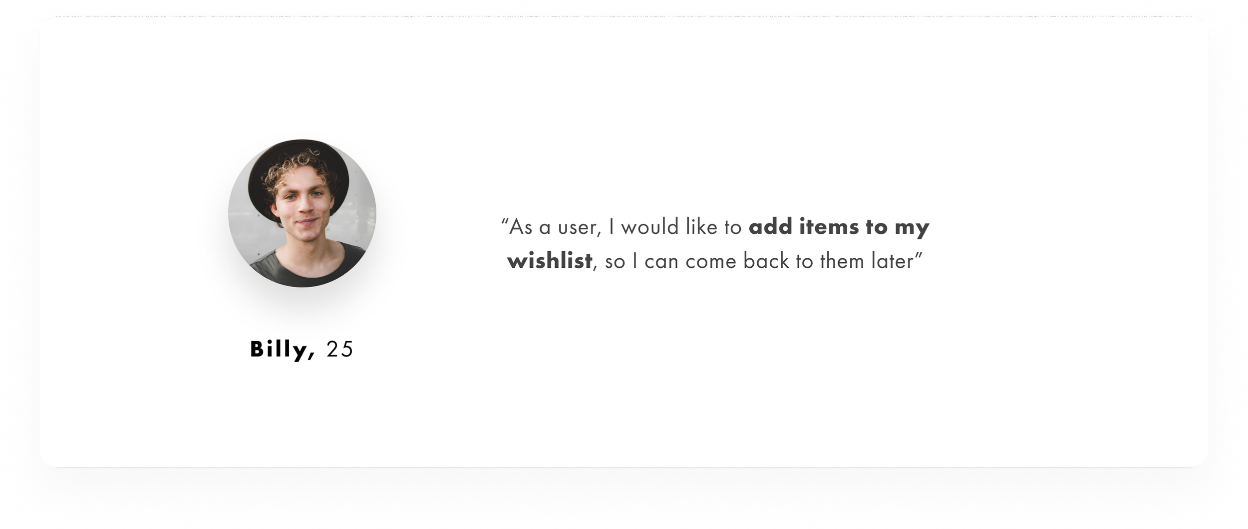
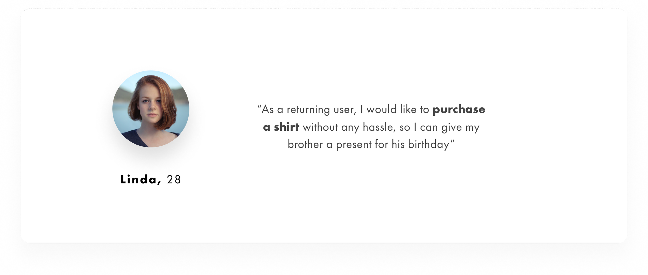
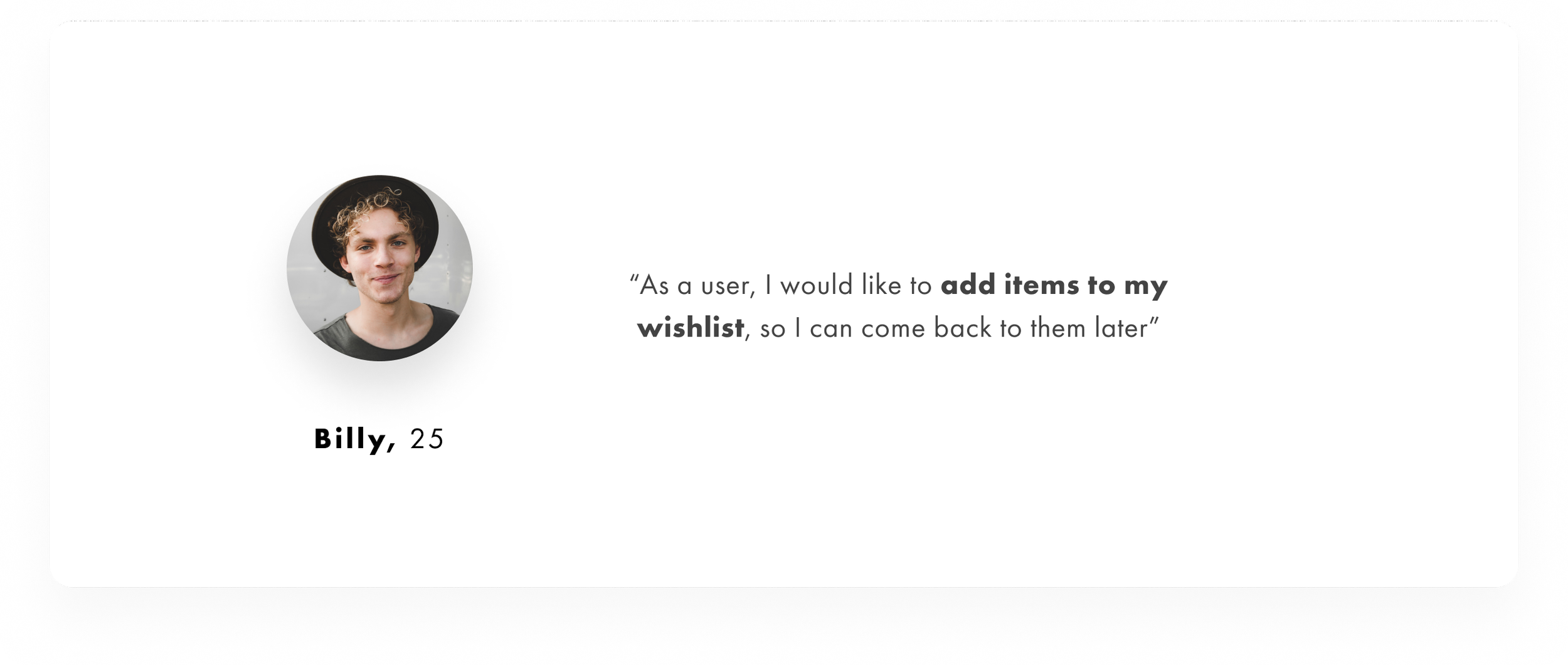
User Personas
Once the findings from interviews were extracted, we used those findings to derive user needs. Our users mentioned that they would like to purchase premium products at the spot or later. So based on those needs, we focused on the two features listed below;
Purchasing a shirt
Adding items to wishlist
User Journeys
User personas are great. However, in order to really understand how the users feel while interacting with our product, I’ve designed user journeys. Keep in mind that these are based on the same features mentioned for user personas.
User Stories
Now that we have user personas and journeys in check. We can start creating user stories.
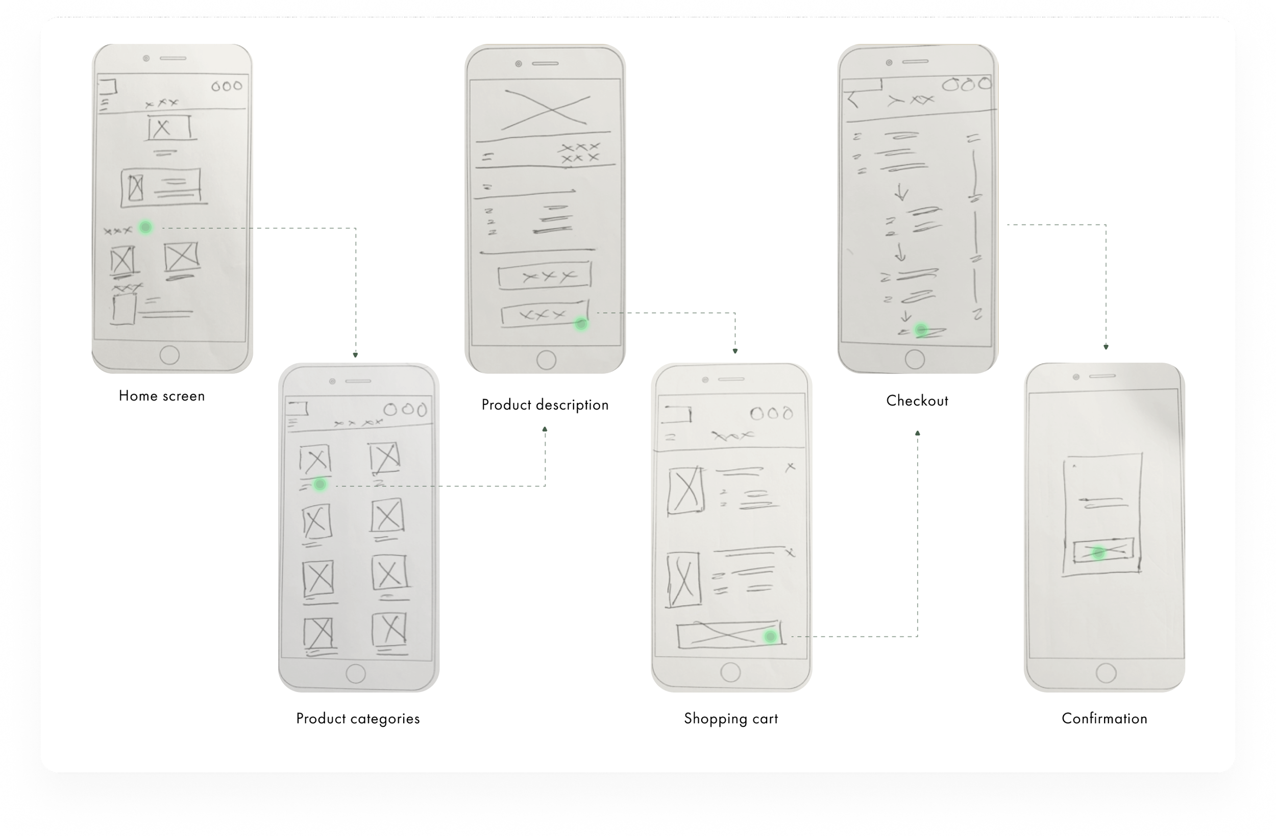
User Flows
To understand what my persona might go through while navigation through the website. User flows were first individually made for each flow and then later on combined.
Low Fidelity Wireframes
Here’s an example of paper prototyping for purchasing a shirt. This is a natural second step after user flows have been created.
So what happened next…?
I took my low-fidelity wireframes and digitized them using Figma. However, I didn’t add that bit to this case study. Let’s jump right into the part you’re here for, shall we?
High-fidelity Wireframes
〰️
High-fidelity Wireframes 〰️
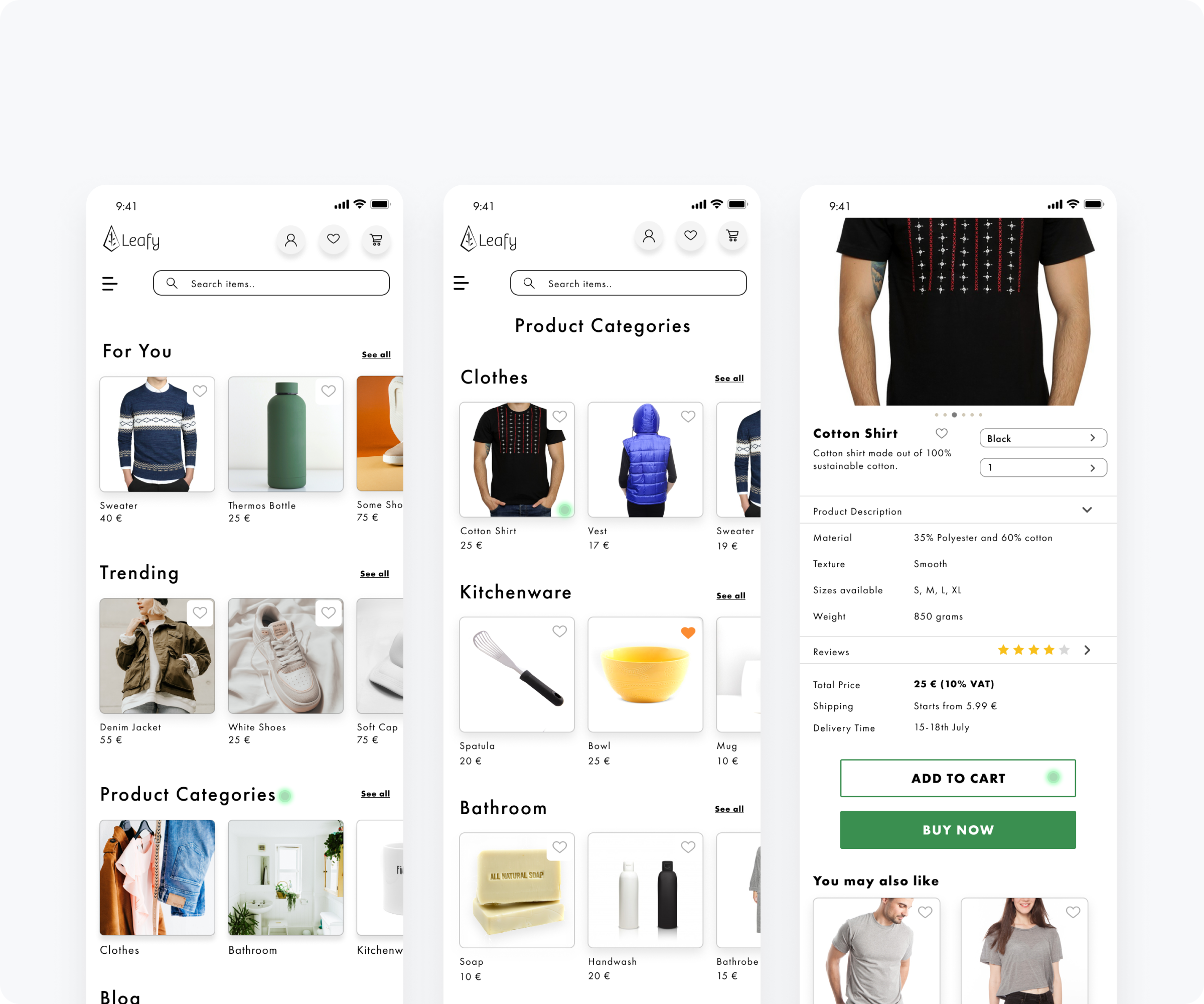
Landing Page

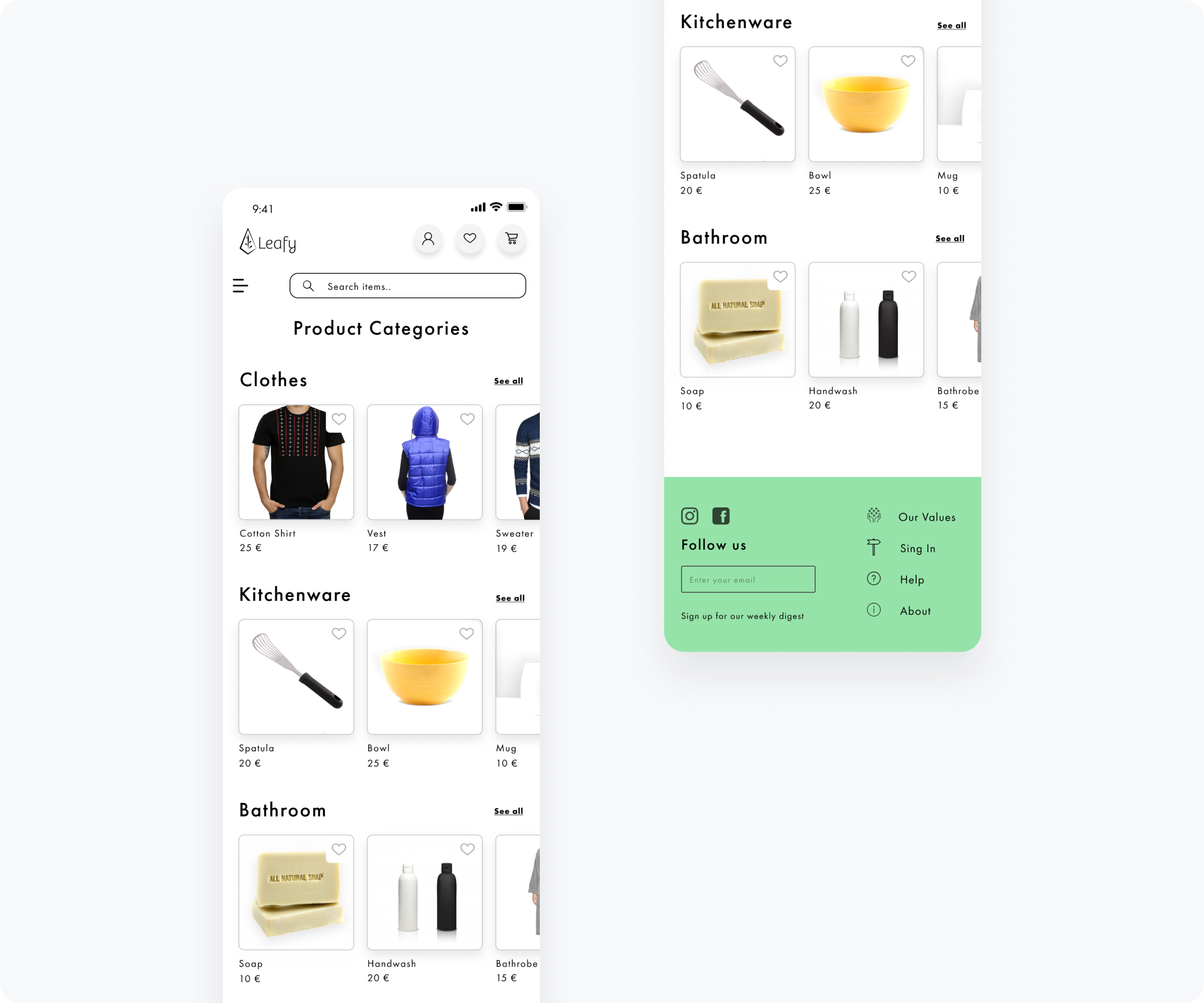
Product Categories
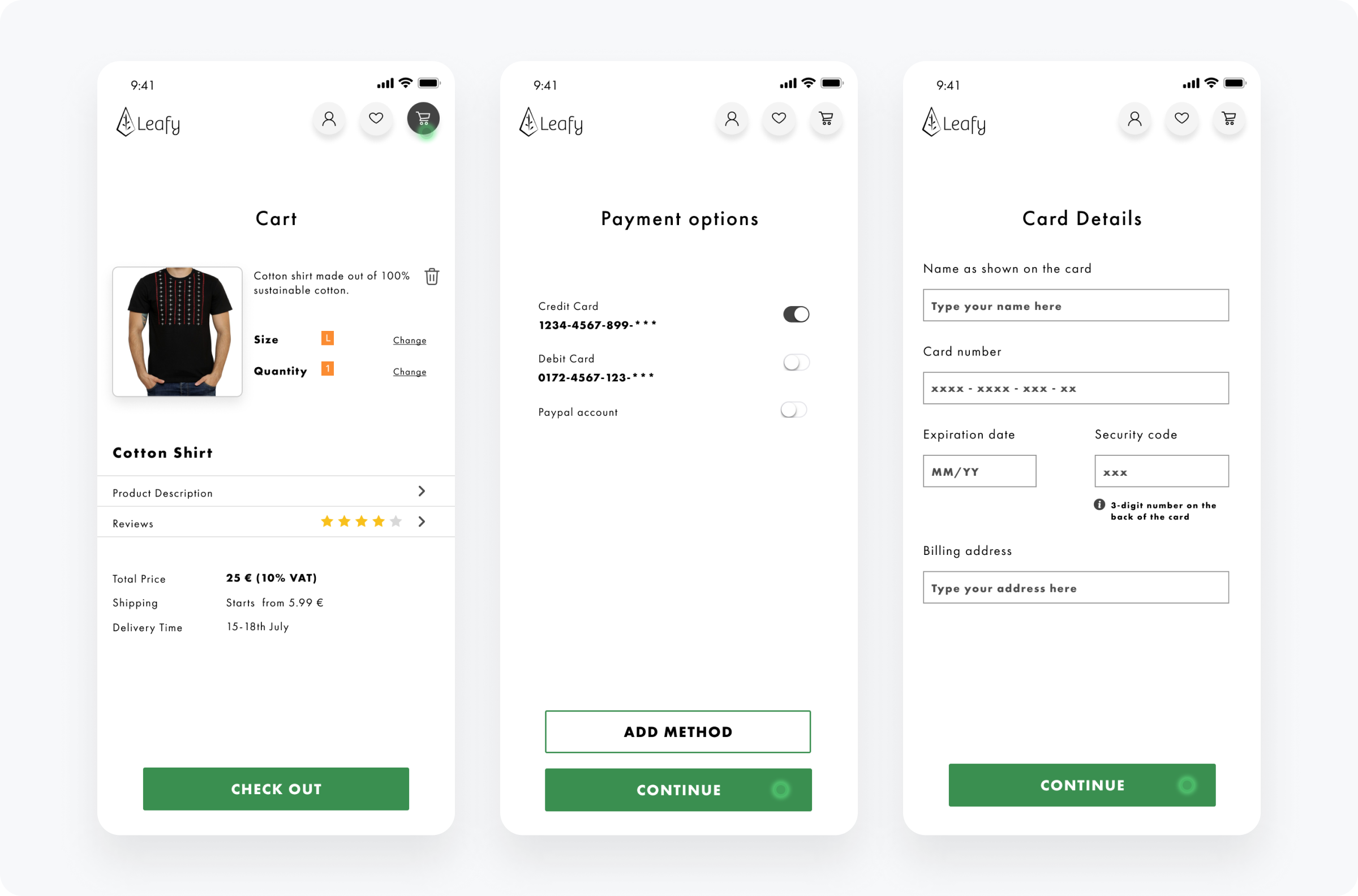
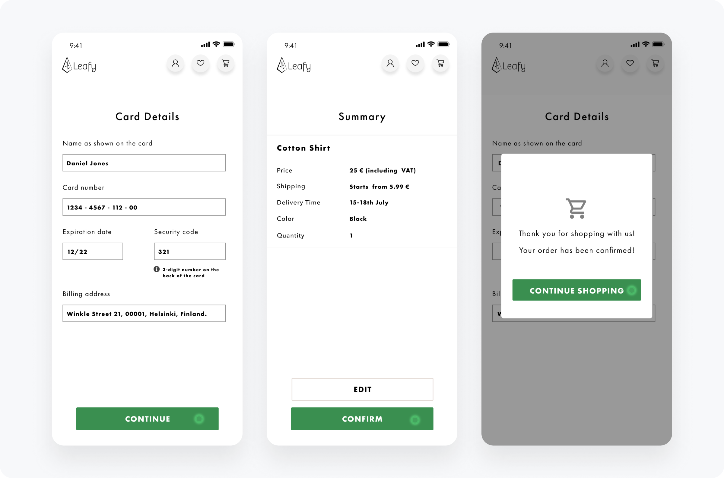
Check Out Process
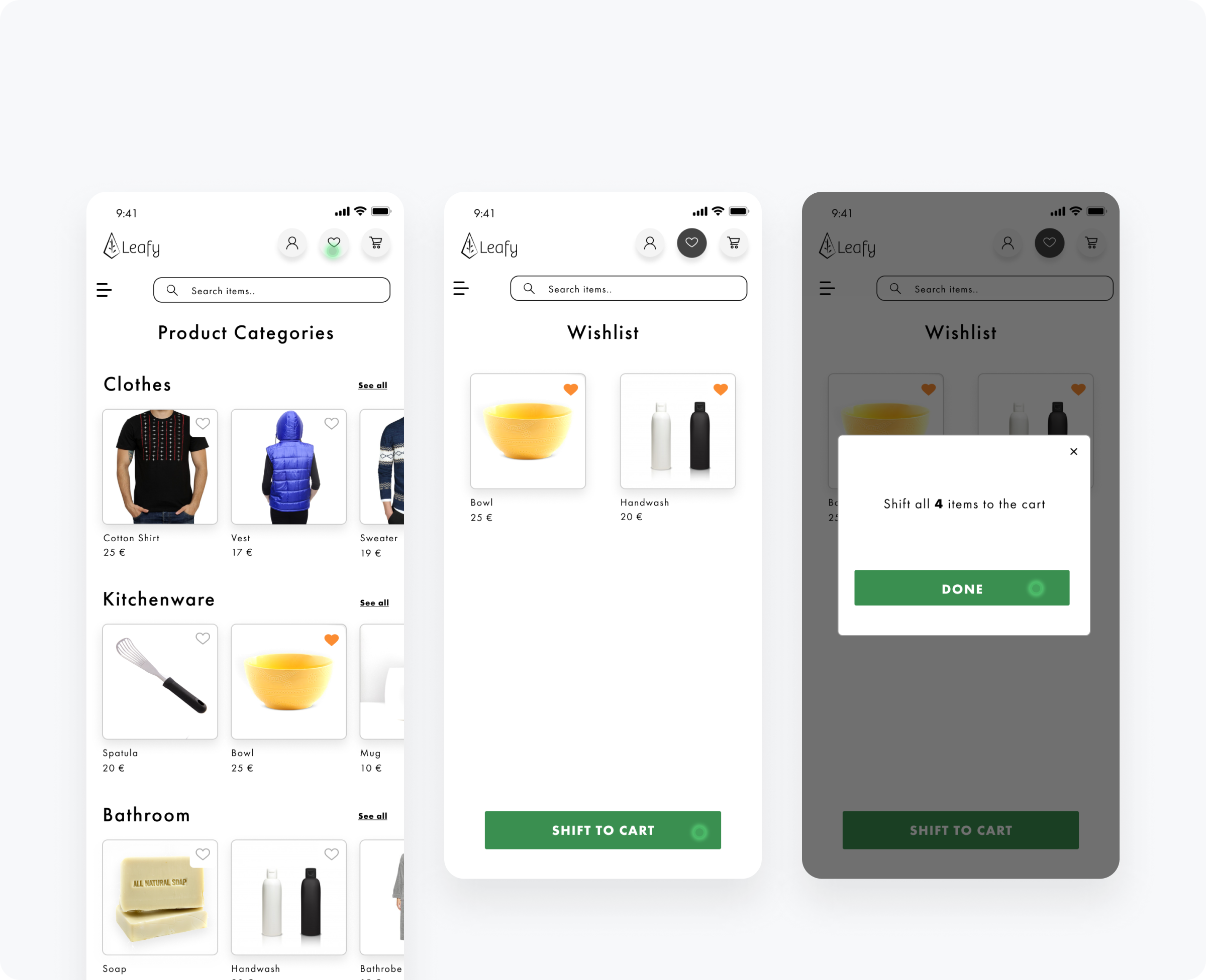
Adding Items to Wishlist
Usability Testing
Results
Most of the participants found the prototype to be extremely user-friendly
A participant noticed that the summary screen was missing, so it has been added to the flow for purchasing a shirt
Overall the usability tests went really well
Mostly positive feedback.
The Finished Product
Retrospect
What went well?
This project was executed brilliantly based on an agile setting. We were able to come up with solid research findings. The visual direction was clear from the get-go. After finishing the prototype, we got it reviewed by the target audience. Everything went well! There were minor issues that got ironed out.
What didn’t go well?
The usability testing went really well. Users had mostly positive feedback. A summary screen was missing from the flow where the user had to purchase a shirt. It was added shortly after the usability tests.
What could be better?
We could also create a prototype for the desktop version of the app. Since users usually purchase items on their phones nowadays, mobile-first was the way to go. If more time and resources are allocated, we could create a prototype for desktop as well.
Here we can see how a user can purchase a shirt. This is what Linda wanted and we finally have a prototype that caters to their needs. Also, for Billy, we have a flow that allows them to add items to the wishlist.